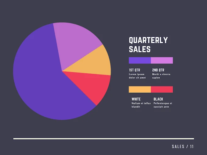
When it comes to visualizing data, pie charts are one of the most popular and widely used tools. These circular graphs are not only visually appealing but also provide a clear and concise way to represent data in a way that is easy to understand. Whether you are a student, a business professional, or simply someone interested in data visualization, understanding how to create and interpret pie charts is a valuable skill to have. In this comprehensive guide, we will explore everything you need to know about pie charts, from what they are and why they are useful, to how to create them and tips for using them effectively.
What is a Pie Chart?
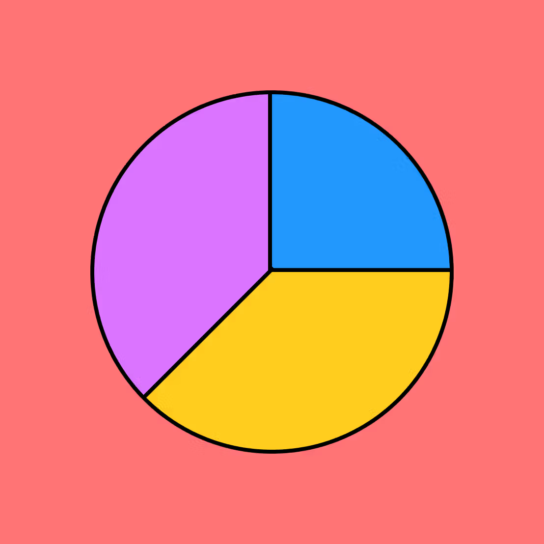
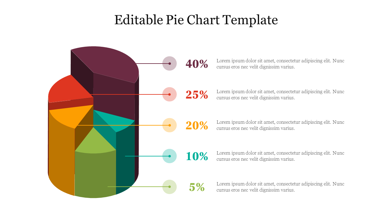
A pie chart is a circular graph that is divided into slices to represent numerical proportions. Each slice of the pie chart represents a different category or value, with the size of the slice corresponding to the proportion of the whole. The entire pie represents 100% of the data, making it easy to see the relative sizes of each category at a glance. Pie charts are often used to show the distribution of data over a set of categories or to compare the sizes of different values within a dataset.
Why Use Pie Charts?
Pie charts are a popular choice for visualizing data for several reasons. First and foremost, they are easy to understand and interpret, even for those who are not familiar with data analysis. The circular shape of the pie chart makes it visually appealing and easy to read, making it an effective tool for presenting data in a clear and concise manner. Additionally, pie charts are useful for highlighting the proportions of different categories within a dataset, allowing viewers to quickly see which categories are the largest or smallest.
What to Include in a Pie Chart
When creating a pie chart, it is important to include all the necessary components to ensure that the data is accurately represented. Here are the key elements to include in a pie chart:
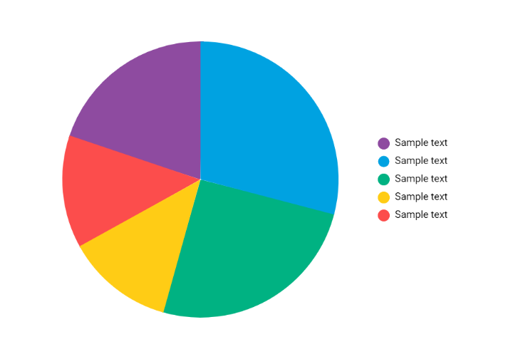
- Data Labels: Each slice of the pie chart should be labeled with the corresponding category or value it represents.
- Legend: If there are multiple categories in the dataset, a legend can be included to provide a key for identifying each category.
- Title: A title should be included to give context to the data being presented and help viewers understand the purpose of the chart.
- Colors: Using different colors for each slice can help differentiate between categories and make the chart more visually appealing.
How to Create a Pie Chart
Creating a pie chart is a relatively simple process that can be done using spreadsheet software like Excel or Google Sheets. Here are the basic steps to create a pie chart:
- Enter Data: Input your data into a spreadsheet, making sure to organize it by categories or values.
- Select Data: Highlight the data you want to include in the pie chart.
- Insert Chart: In the toolbar, select the option to insert a pie chart.
- Customize Chart: Customize the appearance of the chart by adding labels, titles, and colors.
- Finalize Chart: Once you are satisfied with the chart, save or export it for use in presentations or reports.
Tips for Successful Pie Charts
When using pie charts to visualize data, there are several tips to keep in mind to ensure that your charts are clear, accurate, and effective. Here are some tips for creating successful pie charts:
- Avoid Using Too Many Slices: Limit the number of slices in your pie chart to make it easier to read and interpret.
- Use Labels Wisely: Include labels for each slice to provide context and make it easier to understand the data being presented.
- Avoid 3D Effects: Stick to 2D pie charts to prevent distortion and ensure accuracy in data representation.
- Highlight Key Data: Use colors or shading to draw attention to important data points or categories.
- Provide Context: Include a title and legend to give context to the data and help viewers understand the information being presented.
By following these tips and guidelines, you can create informative and visually appealing pie charts that effectively communicate your data to others. Whether you are presenting data in a business meeting, creating a report for school, or simply sharing information with others, mastering the art of pie chart creation can be a valuable skill to have. So next time you need to visualize data, consider using a pie chart to make your information more engaging and easy to understand.

- Wedding Invitation Wording Template - September 27, 2026
- Free Printable Vacation Planner Template - September 27, 2026
- Free Printable Slumber Party Invitation Template - September 27, 2026
